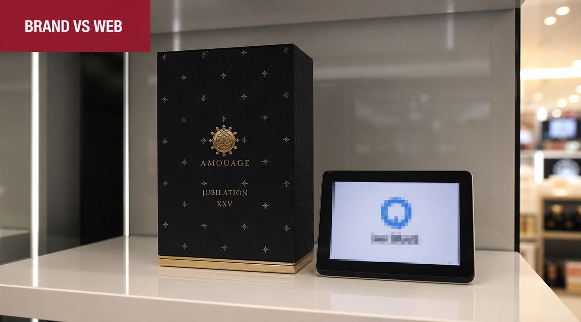
What happens when a premium brand identity that works beautifully on shelf starts underperforming online?
That gap catches more established product brands to an unexpected extent. Packaging can be disciplined. Print can be controlled. Retail presentation can be tightly managed. But web environments are variable, fast, mobile, interactive, and increasingly fragmented across brand sites, retailer pages, marketplace content, landing pages, and regional touchpoints.
That's why graphic design for web can't be treated as a simple extension of traditional branding. It's a commercial system. It has to protect recognition, support trust, communicate product value quickly, and still perform across devices, regions, and platform constraints. For brands moving into international marketplace ecosystems, weak web design isn't just untidy. It creates friction, misreads local expectations, and gradually erodes margin and brand confidence.
When Strong Brand Visuals Become a Commercial Liability
A polished brand guide doesn't automatically produce a strong digital presence.
That's the first uncomfortable truth many established brands run into when they move from retail-led growth into broader online selling. Visual systems designed for packaging, catalogues, trade collateral, and in-store presentation often look refined in static environments. Then they hit real-world digital conditions and start breaking apart.
One issue we repeatedly observe is that brands confuse consistency with rigidity. A print-led identity might depend on fine typography, generous white space, layered textures, and art-directed imagery. On a desktop mock-up, that can still look convincing. On a mobile device, inside a product detail page, or across mixed marketplace environments, the same assets can become slow, hard to scan, and commercially weak.
Where the liability appears
The problem usually shows up in a few predictable places:
- Dense visual treatments: Packaging-style layouts often assume attention. Web users scan.
- Decorative motion: Trend-led motion can add novelty without helping comprehension.
- Overworked hero sections: Brands try to recreate campaign art direction where a clear message and clean path to action would perform better.
- Asset inconsistency: Website pages, retailer content, and marketplace visuals drift apart because the original guidelines weren't built for digital adaptation.
Recent design coverage has highlighted a return of motion-heavy and experimental elements such as marquees, animated cursors, rotated text, and misaligned layouts, yet accessibility guidance warns that moving content should be pausable and autoplay animation isn't recommended, as discussed in this design trend and usability analysis.
Strong visuals become a liability when they demand attention instead of directing it.
For commercial teams, that distinction matters. Good-looking pages can still be weak selling environments. If a visitor can't quickly grasp what the product is, why it matters, whether it feels trustworthy, and what to do next, the design has failed commercially even if it wins internal approval.
Why this gets worse during expansion
As brands add channels, the cost of visual mismatch rises. A campaign-led design language might survive on one owned website. It struggles once the same brand needs to translate across marketplaces, reseller environments, comparison pages, and regional ecosystems.
That's one reason broader online selling strategy often exposes structural design issues that weren't visible in a more controlled retail model. The web punishes anything too precious, too slow, or too dependent on one ideal screen.
The strongest brands don't ask whether their brand book looks premium online. They ask whether their visual system still works when conditions become less controlled.
Web Graphic Design vs Traditional Branding
Australia's shift from print-led design to web-first design didn't happen by accident. It accelerated with the first .au domain in 1986 and the later rollout of the domain name industry in 1996, helping establish the infrastructure designers would eventually build on. Today, auDA reports there are more than 4 million .au domain names registered, which reflects a mature digital environment where websites and interfaces are central to how businesses are found and trusted, as noted in this historical overview of graphic design and digital transition.
That history matters because many businesses still operate with a branding model shaped by older media logic.
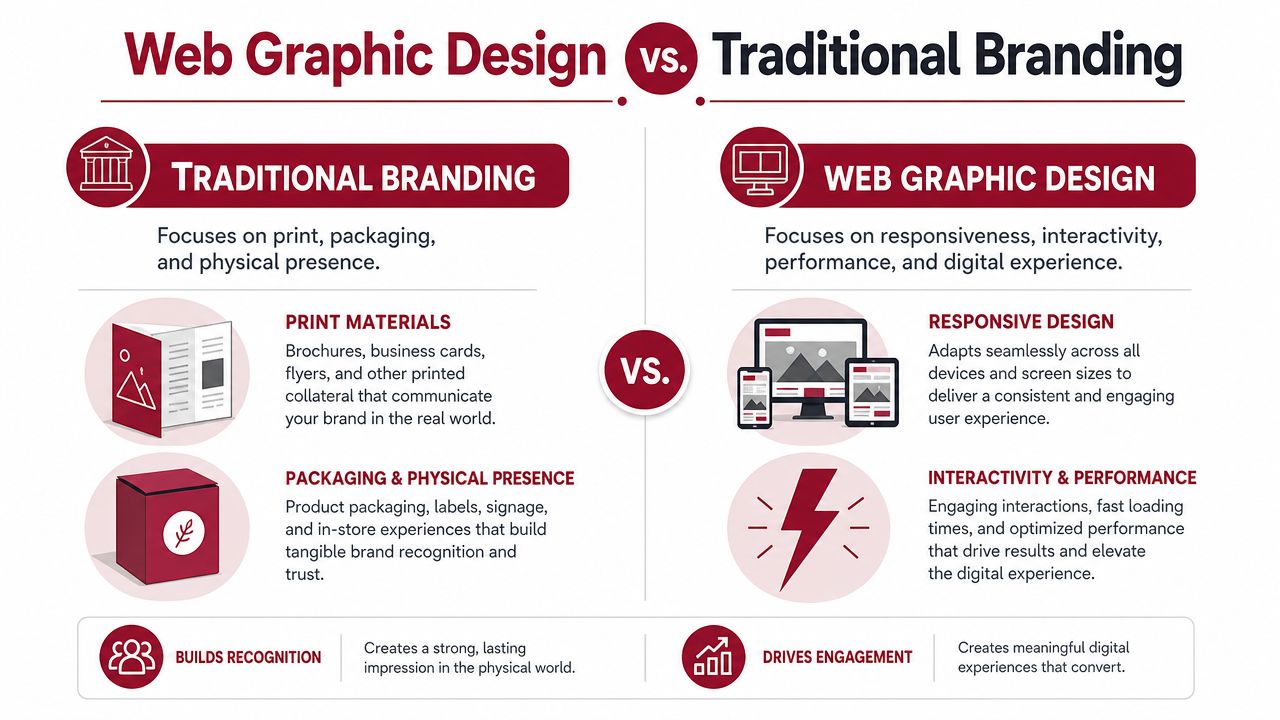
Traditional branding and web graphic design overlap, but they do different jobs. One defines identity. The other translates that identity into an environment shaped by behaviour, devices, speed, and user action.
The practical difference
| Traditional branding | Web graphic design |
|---|---|
| Builds recognition in controlled formats | Builds clarity in variable formats |
| Often assumes fixed composition | Must adapt responsively |
| Communicates in one direction | Must support interaction |
| Prioritises static presentation | Balances presentation with performance |
| Works within controlled physical production | Works across browsers, screens, platforms, and content states |
A printed carton doesn't need to respond to a thumb. A brochure doesn't need to resize for a narrow viewport. A shelf talker doesn't need to account for hover states, reading order, or touch behaviour.
A web interface does.
Why “make the logo fit” is the wrong brief
One pattern we continue seeing is that leadership teams ask designers to “bring the brand online” when what they really need is a digital visual operating system. Those aren't the same thing.
A static identity says, “This is how we look.” A web system says, “This is how we communicate under changing conditions.”
Here's a useful reference point before going further:
Practical rule: If a design decision helps the brand team but slows understanding for the customer, it usually needs reworking.
That's where many expensive redesigns drift off course. Teams spend time preserving every expression of the master brand, but they underinvest in the mechanics that make web communication work: scan patterns, responsive structure, mobile readability, content hierarchy, image behaviour, and action flow.
What web design has to solve that branding often doesn't
A strong web visual system has to answer questions traditional branding can ignore:
- What disappears first on a small screen?
- Which message gets seen before the scroll?
- How does the layout behave when translated or reformatted?
- Can product value still be understood without campaign context?
- Does the page still feel premium when simplified for speed and usability?
That's why graphic design for web should be treated as a commercial discipline in its own right. It isn't lower-level branding. It's branding under pressure.
Building a Cohesive Visual System for Marketplaces
Brands rarely lose clarity because they lack assets. They lose clarity because their assets don't follow a usable system.
Across multiple marketplace ecosystems, the strongest operators build what is effectively a visual grammar. It isn't a folder full of banners. It's a set of rules that keeps the brand recognisable even when the canvas changes from a Shopify collection page to Amazon A+ content, retailer product tiles, paid social creative, or a distributor landing page.
Start with hierarchy, not decoration
For web graphic design, one of the most important constraints is visual hierarchy. Designers recommend contrasting colours, clear ordering, and grouping related elements so people can scan information efficiently. In data-heavy contexts, they also warn against misleading charts by starting axes at zero and avoiding aspect-ratio changes that distort perception, as outlined in this guidance on data visualisation and interface clarity.
That advice applies well beyond dashboards.
If hierarchy is weak, users work too hard. They don't know what matters first. They miss key product information. They confuse supporting details for primary claims. On marketplaces, where attention is fragmented and competitor products sit centimetres away, that confusion becomes commercially expensive.
A practical visual order often looks something like this:
Product identification
The user should know what they're looking at immediately.Primary value communication
This is the payoff. Why choose this over alternatives?Proof and reassurance
Materials, compatibility, compliance, durability, use case, or other trust-building details.Action path
The next step must feel obvious, not buried.
The system has to survive platform changes
A mature visual system doesn't rely on one exact layout. It uses repeatable logic.
That means defining rules such as:
- Type roles, not just fonts: headline, subhead, body, spec label, comparison note.
- Colour function, not just palette: primary action, secondary action, warning, proof point, neutral support.
- Image purpose, not just image style: hero image, in-use image, detail crop, annotated feature graphic, compliance visual.
- Spacing rules: enough consistency that pages feel related even when templates differ.
A brand looks stronger online when it can simplify without losing meaning.
Many catalogue-driven businesses get caught thinking consistency means repeating the same look everywhere. In practice, consistency comes from repeating the same decision logic.
What stronger brands formalise
When visual systems are built properly, teams can adapt without improvising. That's especially important in fragmented channel environments, which is why the difference between a broad product catalogue and a true marketplace ecosystem becomes so visible once brands scale.
A useful internal checklist includes:
- Message priority rules so channel teams don't lead with different claims in different places
- Approved graphic components such as comparison blocks, icon rows, feature callouts, and spec modules
- Image cropping standards so products remain legible across tile sizes and placements
- Fallback versions for mobile, low-attention, or compliance-sensitive environments
The brands that do this well don't create more design. They create less ambiguity.
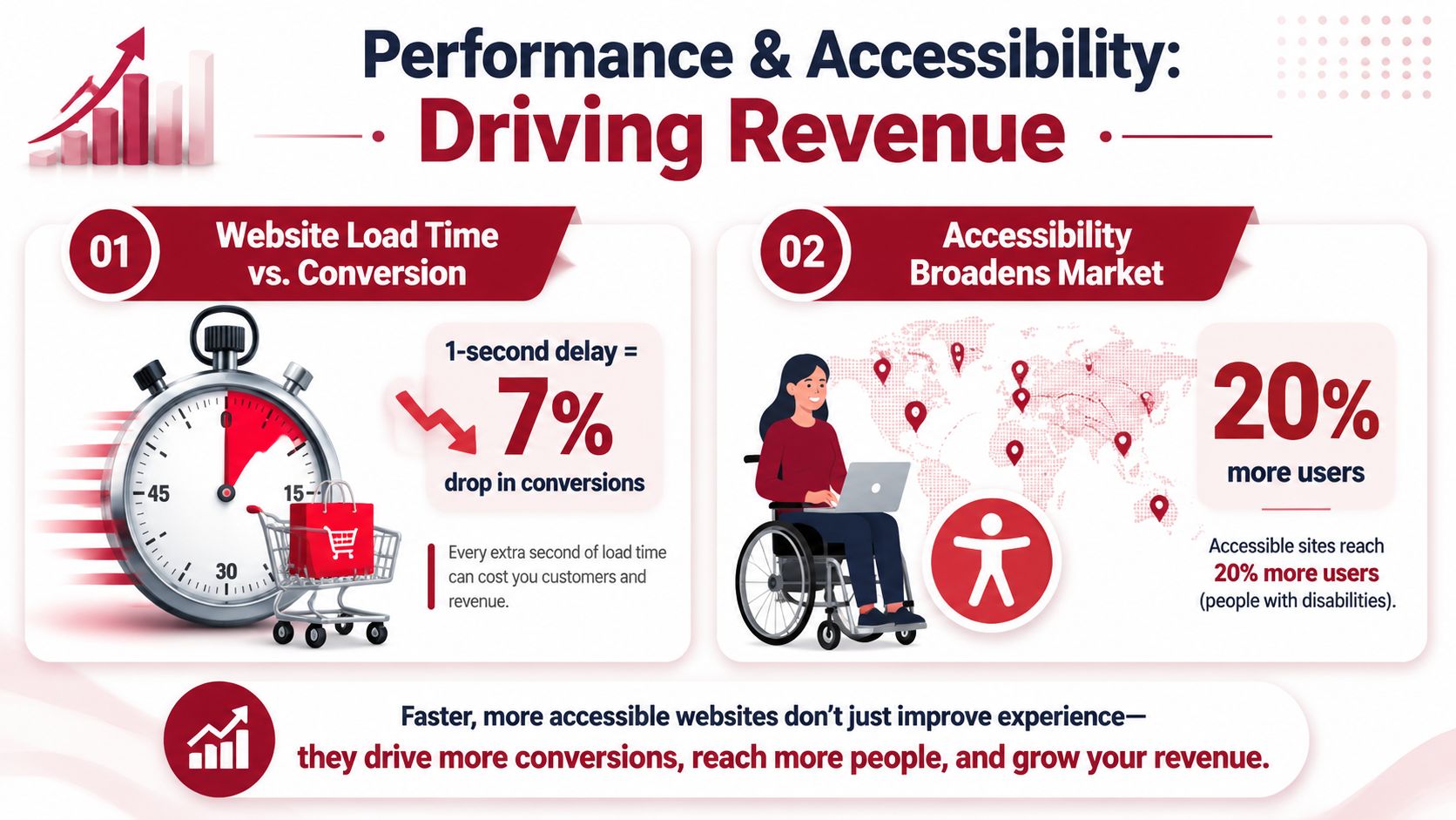
Performance and Accessibility as Commercial Imperatives
Performance and accessibility are often pushed into technical conversations. That's a mistake. They shape how people experience the brand, how quickly they understand the offer, and whether they can act without friction.
In Australia, that matters even more because the practical environment is mobile-first and highly connected. Government accessibility guidance recommends at least 4.5:1 contrast for small text, 3:1 for large text, and touch targets of at least 44×44 CSS pixels (or 48px in related guidance). Those requirements become commercially important when digital use is so routine, as explained in this accessibility guidance for designers.
Poor design doesn't just exclude people. It lowers confidence.
When text contrast is weak, the brand feels harder to trust. When buttons are cramped, the site feels carelessly built. When motion distracts from meaning, the message feels less serious. Users may not articulate those reactions in design language, but they respond to them commercially.
This is especially relevant for product brands in hardware, home improvement, household, and regulated categories, where buyers often need to process specifications, compatibility notes, instructions, or product distinctions quickly. A visually stylish page that obscures those details isn't premium. It's inefficient.
Accessibility is part of conversion design
The common framing is wrong. Accessibility isn't a compliance layer added after the design is approved. It's part of the design quality itself.
A commercially useful design system tends to make a few disciplined choices:
- Contrast that protects readability instead of treating pale text as a premium cue
- Reading order that matches intent so users don't have to hunt for key information
- Touch targets sized for actual thumbs rather than desktop mock-up neatness
- Motion used sparingly and only where it helps interpretation
- Layouts that degrade cleanly when screen width shrinks
The fastest way to make a brand feel less premium online is to make it harder to use.
Designers and commercial teams should also be honest about trade-offs. Large ambient video headers, layered animation, and oversized image treatments can look distinctive in presentation decks. They can also slow pages, distract from product understanding, and create avoidable friction on small screens.
The commercial test worth using
A useful internal review isn't “Does this page look on-brand?”
It's closer to:
| Commercial question | Design implication |
|---|---|
| Can a new visitor understand the offer quickly? | Strong hierarchy and clear copy-image pairing |
| Can they read critical detail without strain? | Adequate contrast and sensible typography |
| Can they act easily on mobile? | Proper touch sizing and uncluttered layout |
| Does the page stay credible when simplified? | Resilient visual system, not decorative dependence |
The brands that treat performance and accessibility as board-level commercial concerns usually end up with cleaner interfaces, stronger trust signals, and more durable digital assets. Not because they chased compliance language, but because they designed for real user conditions.
Localising Visuals for International Expansion
One pattern we continue seeing is that brands confuse translation with localisation.
They adapt copy. They swap a few lifestyle images. They assume the visual system will carry over. Then the brand enters a new region and starts feeling slightly off. Not broken. Just unfamiliar in the wrong way.

For AU-facing work, the environment is already shaped by dense digital usage. The Australian Communications and Media Authority reports that 91% of Australians used the internet daily in 2023–24, with mobile devices the primary access method for most households. The Australian Bureau of Statistics found that 97% of households had internet access in 2021–22. That points to a market where hierarchy, readability, responsive structure, and fast-loading visual systems aren't optional, as summarised in this overview of design history and digital usage context.
Local expectations change what “clear” looks like
A visual that feels premium in one market can feel vague in another. A minimal layout that works for a design-aware audience may underperform where buyers expect stronger product explanation. A heavily aspirational image set may look impressive in one region and low-trust in another if buyers are more specification-driven.
The same applies to platform culture. Marketplace ecosystems teach users what good information looks like. If your graphics don't match that expectation, your product can feel harder to evaluate even when the underlying offer is strong.
Three localisation pressures show up repeatedly:
Information density
Some markets respond better to cleaner editorial spacing. Others expect more visible product detail and reassurance upfront.Image semantics
Usage imagery, room styling, hand positioning, safety cues, and context all affect interpretation.Platform norms
What feels polished on a direct-to-consumer site can feel under-explained inside a marketplace comparison environment.
Visual localisation protects trust
This is why serious expansion work requires more than swapping text layers in Canva or Photoshop. Design choices have to be tested against buyer behaviour, platform conventions, and category maturity.
A recent localisation review often reveals the same issue: the product itself travels better than the visual explanation around it.
International expansion usually exposes visual assumptions that were invisible in the home market.
For brands working through that challenge, marketplace localisation and perceived product familiarity becomes commercially useful thinking. The question isn't whether the visuals are globally consistent. It's whether they create local confidence without diluting brand identity.
What to localise beyond the copy
Founders and commercial leads usually get better outcomes when they review:
- The proof structure used in graphics, including specs, icons, and product claims
- Image context, especially whether the product use case feels locally plausible
- Colour and emphasis choices if certain visual cues carry different weight by market
- Mobile presentation, because small-screen behaviour often exposes localisation weaknesses first
The brands that scale cleanly across regions don't over-standardise. They preserve the brand's recognisable logic while allowing the interface and visual explanation to adapt.
Integrating Design into Your Commercial Workflow
Mature brands don't treat web design as a handoff from marketing to creative. They build it into the commercial workflow.
That changes the question from “What should the site look like?” to “How do our visual assets move through channels, regions, and teams without losing clarity?” The answer usually sits in operations, not aesthetics.
Design needs operating rules
When design is isolated, the same product can end up with different claims, different image logic, and different proof structures across web pages, retailer content, email campaigns, and marketplace listings. That isn't just messy. It weakens trust because buyers encounter different versions of the same brand story.
A stronger workflow usually connects design with:
- Commercial priorities such as margin protection, product focus, and channel sequencing
- Content governance so visual claims remain consistent with packaging, compliance, and product truth
- Market adaptation reviews before assets are pushed into new regions
- QA checkpoints for mobile behaviour, hierarchy, and usability before launch
Information design matters more as the catalogue expands
For AU-facing web work, the WHO's Data Design Language is a useful benchmark because it specifies a consistent, expressive, and accessible vocabulary for presenting data. For product brands communicating compliance, specifications, or performance information, that kind of consistency helps users understand complex material faster when interfaces rely on charts, icons, and interactive elements rather than dense text, as described in the WHO Data Design Language overview.
That's an important operating lesson. As product ranges grow, visual inconsistency tends to multiply around technical content first. Not because teams are careless, but because no one has formalised how information should appear.
What a scalable workflow looks like
The most resilient teams usually standardise a few things early:
| Workflow area | What gets defined |
|---|---|
| Asset creation | Source files, export rules, and approved component library |
| Review process | Brand, commercial, UX, and market adaptation checks |
| Channel deployment | Which layouts and visual modules fit each platform |
| Ongoing maintenance | Version control, replacement process, and localisation updates |
A recent review of a pricing and build-quality discussion around web design considerations in Brisbane points to the same broader issue. Design decisions don't sit in isolation. They connect to capability, execution quality, and whether the final system can support real commercial use.
The brands that handle graphic design for web well usually have fewer dramatic redesigns. They don't need to keep reinventing the front end because the underlying system is already built to flex.
TPR Brands works with established product brands that need more than attractive digital assets. It helps teams build commercially cohesive brand systems that translate across marketplaces, regions, and growth stages without losing trust, clarity, or brand value. If your business is preparing for channel expansion, localisation, or a more structured international push, explore TPR Brands for a more operator-led approach.